Welcome to the field the world doesn’t know it needs
Imagine, if you will, a humungous jumble of puzzle pieces. There are no corners in sight, you don’t know how many you’re supposed to have, plus, you’re missing the picture on the box, so you can’t even tell what’s meant to emerge from this chaos.
Enter Shehryar (“Shay”) Saharan. Not only will he solve the puzzle for you, but he’ll make it look easy. Saharan is a scientific visualizer and illustrator, which means he uses art and design to render the complex understandable for a casual audience. Under his eye, reams of data become one aesthetic graphic, a mess of blood and bone becomes a streamlined diagram, and an overwhelming global phenomenon becomes digestible in eight neat panels.
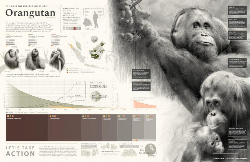
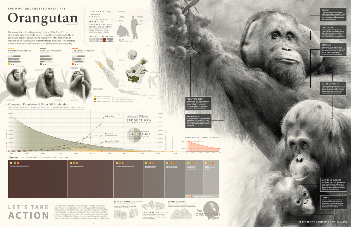
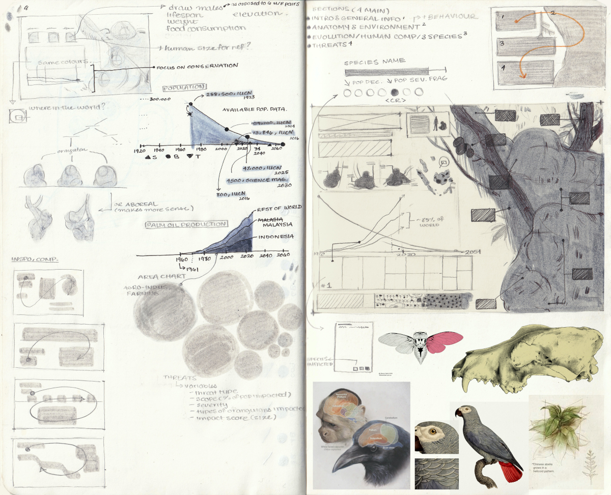
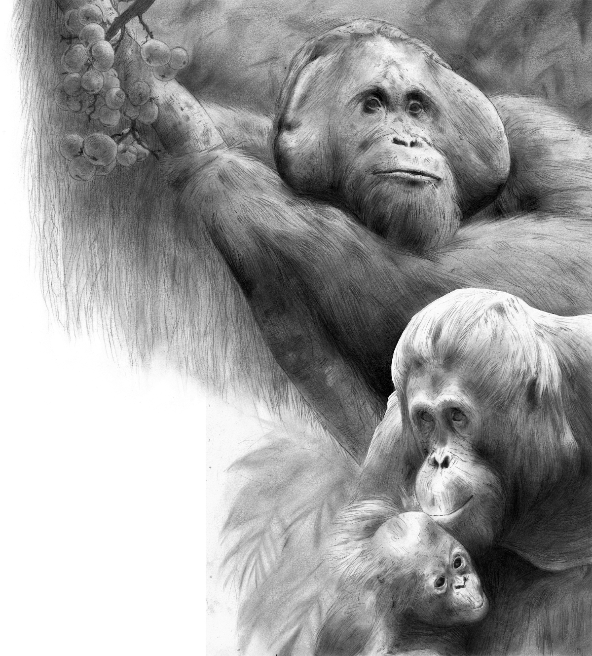
Saharan is currently in the University of Toronto’s Master of Science in Biomedical Communications (“BMC”) program. For one of his assignments, he completed a two-page spread that explained the fundamentals of orangutan biology and why their population is declining so quickly. Working with the president of The Orangutan Project, Leif Cocks, Saharan created a visual that shows how palm oil, found in over half the products in our supermarkets, directly contributes to the rapid deforestation of orangutan habitats. Which upsets Saharan for personal as well as environmental reasons. “I love that animal,” he tells me. “It’s my favourite animal!”
This BMC program is one of only four accredited programs of its kind worldwide. When I ask Saharan why he thinks that is, he frowns, reflecting. “I’m actually not sure because there’s so much work to be honest,” he says. “One of the reasons might be that people still don’t know they need us, in a lot of ways. And I’m not quite sure why that is either.” Saharan estimates there are, globally, a mere one thousand practising professional scientific visualizers.
But the field is inarguably important with its capacity to present accessibly research that people might otherwise consider beyond their reach. “It is so essential for things to be presented in a way where it’s not this kind of elite,” Saharan says. “If you if you want it to be accessible, it can be accessible.”
And, evidently, people do. Though they are still students, Saharan and his cohort are being offered more work than they can accept. Saharan tells me he has “never had to not apply for a job…people are wanting to work with us left and right!” Saharan accepts freelance projects and also takes part in a Clinical Education and Biomedical Communications Co-op program at Baylis Medical in Mississauga, Ontario. The company develops and distributes medical products and recruited Saharan to pioneer an interactive education program for their sales team.
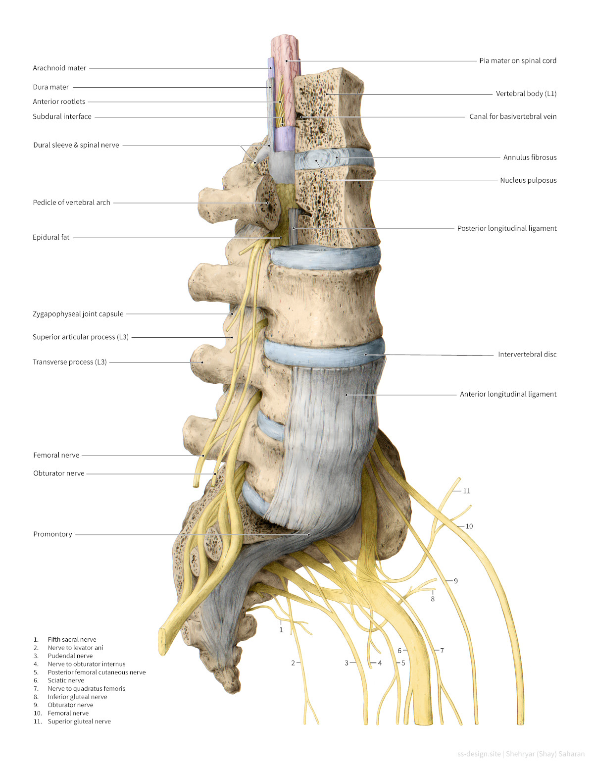
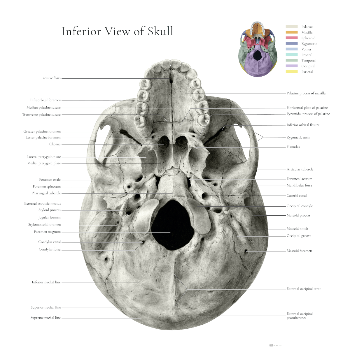
When we discuss Saharan’s hyper-detailed anatomical illustration of a skull, I ask him what he used for reference. “So, we had skulls mailed to us,” he says, nonchalantly. He adds quickly, perhaps in response to my expression, “But they were plastic skulls though, not human specimens!” He also consulted anatomical atlases and photographs. He estimates the project took him twenty to thirty hours to finish.
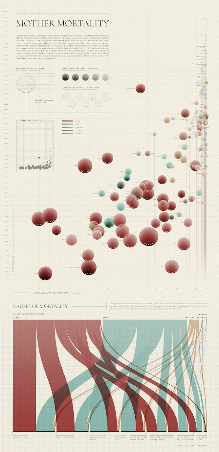
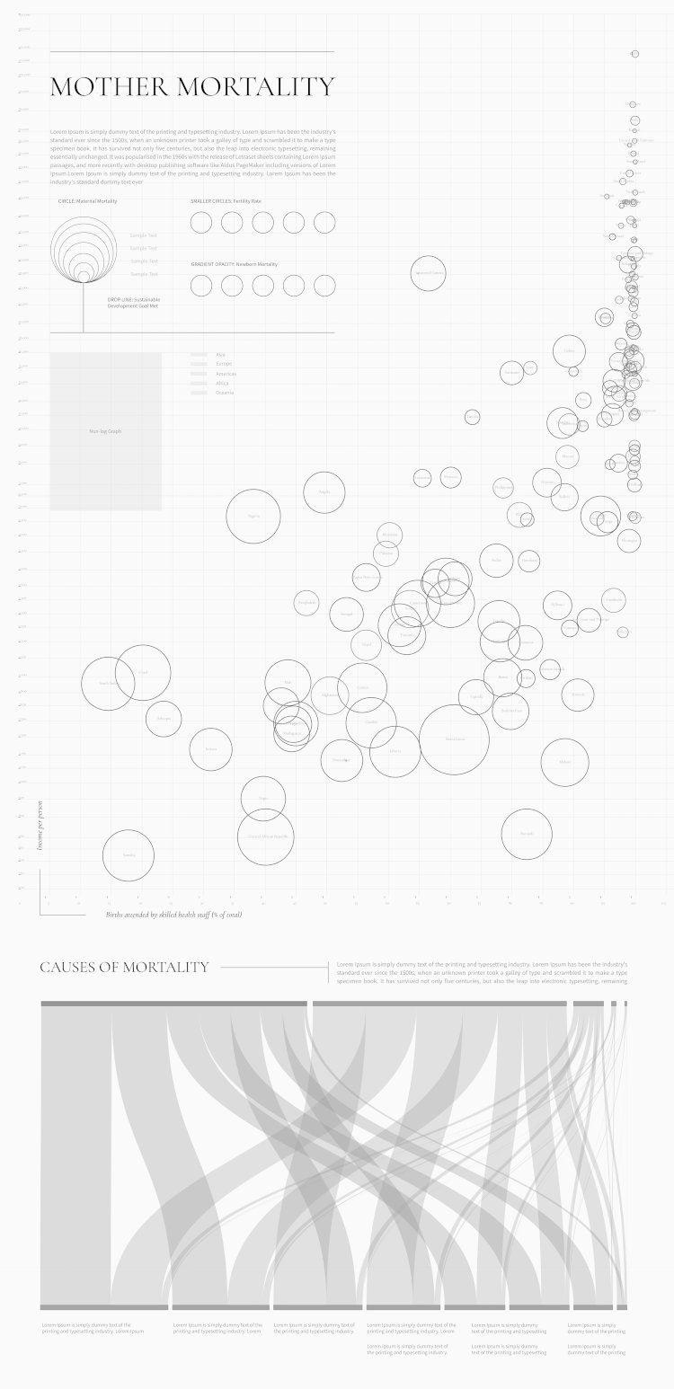
Another of Saharan’s visualizations explored global mother mortality rates and the factors that contribute to these deaths. Saharan combed through tangles of data and realized that, to communicate his findings the way he wanted to, he would have to invent a completely new kind of graph. He created a “Bubble Chart,” which shows through size, opacity, and positioning of the bubbles how access to quality healthcare and income level affect the likelihood that a mother and her baby will survive childbirth.
Because no software exists for creating this novel graph, the work took a long time—two weeks, if he had worked eight straight hours a day, Saharan estimates. He used Tableau for the main framework but had to add details by hand. “I sat down for like eight hours adding dots to each bubble. It’s all manual. And changing the opacity was all manual, and I had to do that for each continent. It’s so specific that nothing out there exists,” he tells me.
When Saharan explains the process of creating such a visualization, he refers to amalgamating mountains of data into a layout as “the fun part,” which, in my opinion, proves he has chosen the correct field.
“It’s kind of like solving a mystery,” he explains. “It’s shuffling things around. The layout is like a puzzle, and you’re just putting it together in a way that’s like, okay, this is where everything fits. This is where it makes sense.”
See full sized detailed image here.
See full sized detailed image here.
He likes to follow a similar framework for every project, which always starts with a load of research and, as he puts it, “understanding the science, which sometimes hurts me inside because I want to just jump in.” But he pushes through the pain to get to the point where he can explain the concept to someone else (sometimes his little brother, who is in grade 10). “[Without that] I don’t think your strategies for how you break it down and make it digestible will be as effective as possible,” he says. This stage also involves “data cleaning,” or refining your data sets to make sure no variables are missing or irrelevant.
The next step is gauging what resources, like graphics and animations, about the subject already exist. Saharan likes to create mood boards for his pieces to evaluate upon what he can build. He ruminates on what story he needs to tell to best communicate the information—what is the scope of this content? What will the focus be?
“And the next part is definitely sketching like crazy,” he tells me. “Just any idea that comes to mind will go down on paper, and I never stop at the first composition.” Saharan sketches by hand and sometimes does “carbon dusting,” drawing using scraped carbon collected in a petri dish. He’ll then use software like Tableau, Adobe Photoshop, and Adobe Illustrator for the final product.
Saharan usually completes at least 10 different layouts before deciding, with input from relevant experts, on the winner. He admits it feels a bit bizarre to be left with two pages after weeks and weeks of work. But, he stresses, that’s an indication he’s made a good design. A viewer should see it and go, “‘Wow, that’s so simple. I understand that!’ And that’s the beauty of it,” he says.
If you happen to be considering scientific visualization as a career path and have any doubts about it, Saharan would like to squash them. “There’s so many fields you can work in, and the industry is limitless, and you’re still needed everywhere,” he says. “And don’t be afraid to just jump in, and it’s awesome, and I love it. That’s important! It’s the best thing.”
This image includes animated GIFs, which you can see in Saharan’s portfolio.
Find out more about Saharan on his website, LinkedIn, and Instagram.
*
All images courtesy of the artist.
Share this Post